Posters that`ll make go "Ohh" vs Posters that`ll make you go "Eww"
Shaquille Parker
Blog Post- Homework Assignment
10/4/17
Professor Pabico
Within graphic design people create posters for some sort of
occasion wither it be to promote a film, festival, concert, products or some
upcoming activity. Or some cases poster is created to persuade or convince
someone of doing something such as an anti-smoking ad or getting someone out to
vote. Whatever the case may be, a well design poster will achieve that objective
as to a poorly design one will fail in doing so.
GOOD POSTER
DESIGNS
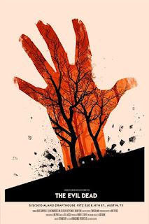
 This
poster advertising the 2010 horror film “The Evil Dead” could be consider a
great poster design as it really catches the eye of the viewer, at first glance
one could easily see the hand but the imagery within the hand is what really
shows the creativity of the marketing team who design this. They used the
forest and cabin in which the film takes place to give a gist of how the film
is. For the those who didn’t know this was a horror without the indication of
the obvious title could find this out from the hand spotting from the ground,
somewhat indicating that this film could feature some undead entity. Besides
the hand itself the poster has so many little details within in it that with
just one or multiple looks at this poster could get the interest of many.
There
is a lot of effective subliminal imagery within this film poster design, some
of which the viewer wouldn’t have notice at first glance. But what would catch
their attention is the very ominous and unnerving face in the poster, without
or with have reading the film’s title most could have figure out that this is
the movies villain. The subliminal imagery upon further look shows that
the figure`s face creates both an image of Gotham city the films setting as
well as batman the films protagonist. The creators of this image do a very
effective job with color, the use of black and a very dark white almost or somewhat
grey give the impressions that this is a very gritty film.

BAD POSTER DESIGNS
The poster here does not do a very good job of attracting any attention to it, as the cluster and large grouping of words would turn most people away all due to the simple fact that they don’t care to read that much, especially when just walking by a street sign or school activity boar. The poster has too much happening within in it, and the many font types do not in help in any way. There are many things in this poster that could have been left out to make it effective as well as sticking to 1 or 3 fonts.
This is another example of poster that is done poorly do to
the result of cluster. The image has no well put together structure of words,
rather everything is all over the place, making the viewer confused and turned
off when viewing it. The image makes it difficult to know where to begin
reading from, so one wouldn`t really know what the objective of the poster is
in some cases. Although it has slight some details within it, that it ruined by
it poor placement.
This image
has a weak design since it leaves you with nothing to interpret but that fact
that the image of the head and shadow of the figure might have something in
common. The head is poorly photo-shopped into the dark shadow image to a point
where it may come off as laughable. This image does poorly in convincing the
viewer that it has any interesting aspects about the film.
In Conclusion, there are many
things that separates a good poster design from a bad poster design, a good
poster design will always interest who view it and always achieve its objective.
A bad poster design will turn people away and fail its objective.


Comments
Post a Comment